
Lawrenceville Fuel Co.
Plumbing • Heating • Air Conditioning • Fuel Oil
Established in 1925, Lawrenceville Fuel Company is local family-owned business right off Main Street. With even earlier roots going back to ice deliveries in the late 1800’s, this company has been servicing the area for many decades and through 5 generations.
These deep ties to the community inspired the retro campaign to help market their fall and winter services. A mid-century modern theme was selected because it harkens back to some of the earlier days in the fuel company’s history. It’s also when they started incorporating the services they are known for today: plumbing and air-conditioning, which was a major turning point for the company.
Since their start, their services have evolved, but their brand image and brand messaging have not. They are a full-service HVAC and plumbing business that takes pride in it’s community. To show their long-standing ties, they needed a marketing campaign that captured their history and how they continue to evolve. A no frills, future forward looking campaign with established roots to visually communicate exactly what they’re about.
I was tasked with creating a vintage-inspired logo. I chose a mid-century modern handwritten font and then paired it with a sans serif font and a cartoon plumber.
I retained the company colors of yellow and green since those are iconic to their brand.

In addition to creating a promotional logo, I designed and silkscreened new t-shirts for the employees to raise brand awareness. The old work shirts the employees wore were dark green, had a busy back design, and a dated logo. So I paired down the design and reversed the color scheme to lighten it up. By using yellow as the t-shirt color, it feels modern and friendlier than the old design, which is what Lawrenceville Fuel wants customers to associate with them: friendly customer service.

For their fall campaign, they knew they had to stand out from all the competitors’ mailers. We had already decided on using a mid-century modern look, so we kept that theme with their mailer. I shied away from photos of houses, products they sell, and images of hot and cold. Instead, I was inspired by ads from the 50’s/60’s that used illustrations and handwritten fonts.
They needed a design that was direct and was visually different from local competitors. The competition consists of cookie-cutter HVAC themes, including: color palettes of blue/red, images of houses, icons of fire and ice (for heating/AC), and sans serif fonts. So I leaned into Lawrenceville Fuel’s true self and created a bright customer-friendly look that reflects a simpler time.
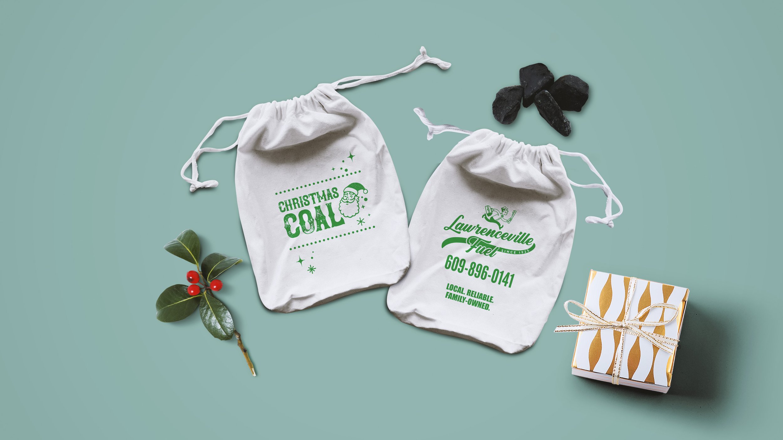
Promotional giveaways are a good way to stay with the customer long after your work is done. But customers don’t need another pen, magnet, or beer koozie. Lawrenceville Fuel wanted an item that was different from the usual promo items you get while also have a winter or holiday theme.
The origin of Lawrenceville Fuel Company was a coal delivery service. In the early days of the company, the operating family used to bag up coal as “presents” for family and friends as a prank to play on kids for Christmas. Getting coal in your stocking is a classic Christmas stocking gift for naughty children. So it only felt natural to have coal be a part of their winter/holiday marketing.
I designed and silkscreened novelty coal bags as an additional promotional item. The mid-century modern theme was also applied to these coal bags with a cartoon santa, classic mid-century modern stars, and a hand-lettered font. These are available for free at the main office for customers.